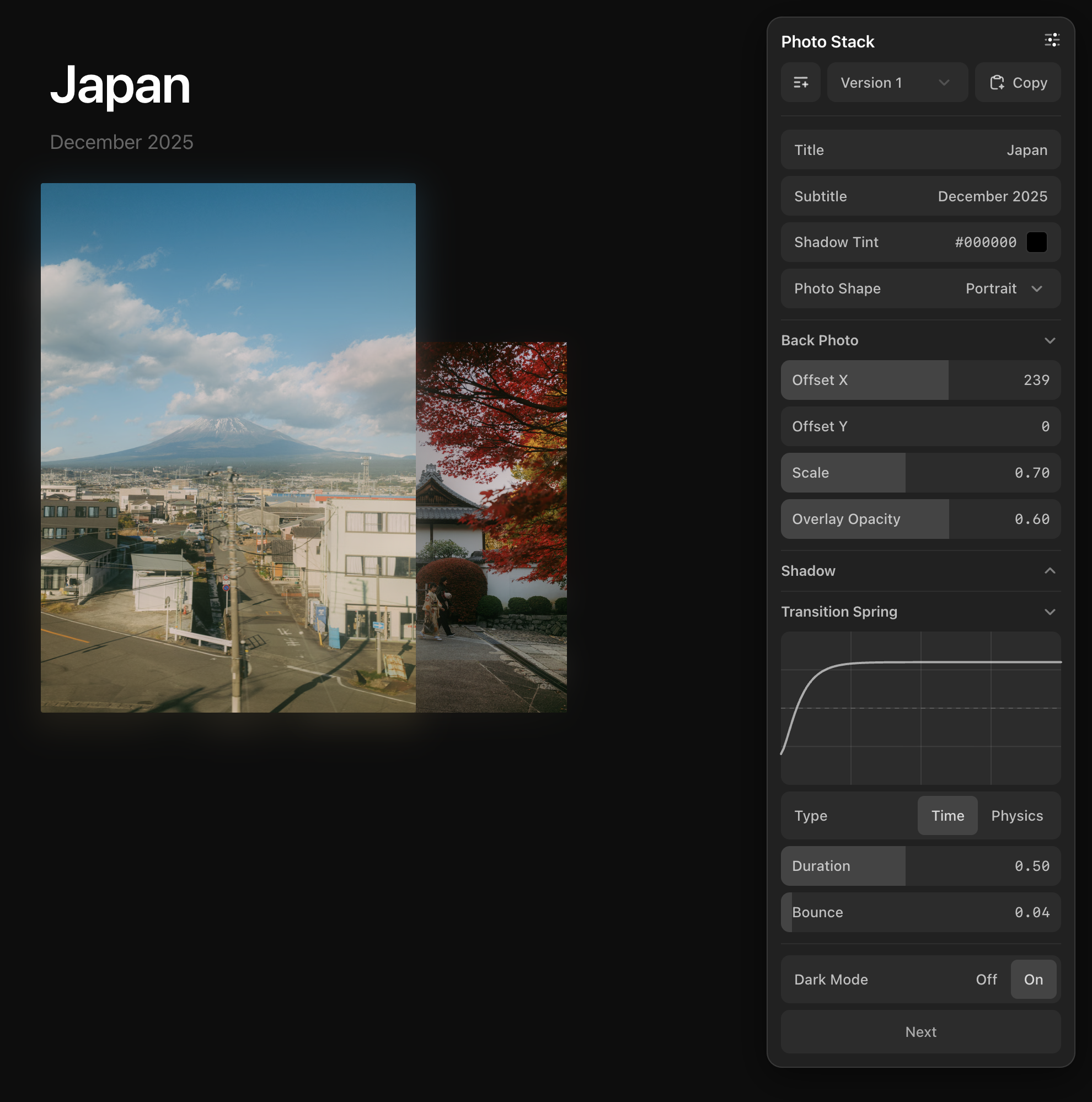
Real-time parameter tweaking for React, Solid, Svelte, and Vue, created by Josh Puckett. Now with a scrubbable animation Timeline.
To learn more about how I use DialKit, and approach design in general, feel free to check out Interface Craft.
- Open an issue first. All pull requests should reference an existing issue. PRs without a corresponding issue will be closed.
- Keep PRs small and focused. Each pull request should address a single change — one bug fix, one feature, or one refactor. Avoid bundling unrelated changes together.
- No unnecessary dependencies. If your change can be accomplished without adding a new dependency, it should be. Any new dependency needs justification in the PR description.
npm install dialkit motion// layout.tsx
import { DialRoot } from 'dialkit';
import 'dialkit/styles.css';
export default function Layout({ children }) {
return (
<html>
<body>
{children}
<DialRoot />
</body>
</html>
);
}// component.tsx
import { useDialKit } from 'dialkit';
function Card() {
const p = useDialKit('Card', {
blur: [24, 0, 100],
scale: 1.2,
color: '#ff5500',
visible: true,
});
return (
<div style={{
filter: `blur(${p.blur}px)`,
transform: `scale(${p.scale})`,
color: p.color,
opacity: p.visible ? 1 : 0,
}}>
...
</div>
);
}const params = useDialKit(name, config, options?)| Param | Type | Description |
|---|---|---|
name |
string |
Panel title displayed in the UI |
config |
DialConfig |
Parameter definitions (see Control Types below) |
options.id |
string |
Stable logical id for sharing values across remounts/pages |
options.persist |
DialKitPersistOptions |
Persist values to browser storage |
options.onAction |
(path: string) => void |
Callback when action buttons are clicked |
options.shortcuts |
Record<string, ShortcutConfig> |
Keyboard shortcuts for controls (see Keyboard Shortcuts) |
Returns a fully typed object matching your config shape with live values. Updating a control in the UI immediately updates the returned values.
By default, a DialKit panel is tied to the lifecycle of the component that calls useDialKit. Pass id when multiple mounts should reconnect to the same logical panel, and pass persist: true when values should survive reloads and browser sessions.
// dials/useOnboardingDials.ts
import { useDialKit } from 'dialkit';

export function useOnboardingDials() {
  return useDialKit('Onboarding', {
    name: { type: 'text', default: 'Avery', placeholder: 'Name' },
    avatarScale: [1, 0.6, 1.6, 0.01],
    accent: { type: 'color', default: '#6C5CE7' },
  }, {
    id: 'onboarding',
    persist: true,
  });
}
Use that helper anywhere the shared values are needed:
function PageTwo() {
  const onboarding = useOnboardingDials();

  const page = useDialKit('Page Two', {
    cardRadius: [16, 0, 64],
  });

  return (
    <Card
      name={onboarding.name}
      radius={page.cardRadius}
      accent={onboarding.accent}
    />
  );
}
When PageTwo is mounted, the single <DialRoot /> shows both Onboarding and Page Two as top-level sections. If another page calls useOnboardingDials(), DialKit reconnects to the same id and keeps the shared values.
persist: true stores values, presets, and the active preset in localStorage using dialkit:${id} as the key. Use the object form to customize storage:
useDialKit('Onboarding', config, {
  id: 'onboarding',
  persist: {
    key: 'my-app:onboarding-dials',
    storage: 'sessionStorage',
    presets: false,
  },
});
The id string has no special format; it only needs to be reused wherever you want the same logical panel. Without id or persist, DialKit behaves exactly as before.
Use the controller API when your app code also needs to update DialKit values, such as reset buttons, URL sync, or app-defined preset buttons.
import { useDialKitController } from 'dialkit';

function Card() {
  const dial = useDialKitController('Card', {
    blur: [24, 0, 100],
    scale: 1.2,
    color: '#ff5500',
    visible: true,
    shadow: {
      radius: [16, 0, 64],
    },
  });

  return (
    <>
      <button onClick={() => dial.setValues({
        blur: 48,
        scale: 1,
        shadow: { radius: 28 },
      })}>
        Apply preset
      </button>
      <button onClick={() => dial.resetValues()}>Reset</button>

      <div style={{
        filter: `blur(${dial.values.blur}px)`,
        transform: `scale(${dial.values.scale})`,
        color: dial.values.color,
        opacity: dial.values.visible ? 1 : 0,
        borderRadius: dial.values.shadow.radius,
      }}>
        ...
      </div>
    </>
  );
}
Controller methods:
| Method | Description |
|---|---|
values |
The same live resolved values returned by useDialKit |
setValue(path, value) |
Updates one control by dot path, like 'shadow.radius' |
setValues(values) |
Updates multiple controls with a typed nested partial object |
resetValues() |
Restores the current config defaults and clears the active preset |
getValues() |
Reads the latest resolved values outside render callbacks |
Programmatic updates use the same state as panel edits. If a saved preset is active, updates are saved into that preset; otherwise they update the base "Version 1" values. Action controls are triggers, so they are not set by setValues.
Numbers create sliders. There are three ways to define them:
Explicit range — [default, min, max]:
blur: [24, 0, 100]Explicit range + step — [default, min, max, step]:
blur: [24, 0, 100, 5] // snaps in increments of 5When step is omitted, it's inferred from the range (see table below).
Auto-inferred — bare number:
scale: 1.2A single number auto-infers a reasonable min, max, and step:
| Value range | Inferred min/max | Step |
|---|---|---|
| 0–1 | 0 to 1 | 0.01 |
| 0–10 | 0 to value × 3 | 0.1 |
| 0–100 | 0 to value × 3 | 1 |
| 100+ | 0 to value × 3 | 10 |
Returns: number
Sliders support click-to-snap (with spring animation), drag with rubber-band overflow, and direct text editing (hover the value for 800ms, then click to type).
enabled: true
darkMode: false
Booleans create an Off/On segmented control.
Returns: boolean
title: 'Hello'                                    // auto-detected from string
subtitle: { type: 'text', default: '', placeholder: 'Enter subtitle...' }
Non-hex strings are auto-detected as text inputs. Use the explicit form for a placeholder or to set a default.
Returns: string
color: '#ff5500'                           // auto-detected from hex string
bg: { type: 'color', default: '#000' }     // explicit
Hex strings (#RGB, #RRGGBB, #RRGGBBAA) are auto-detected as color pickers. Each color control has a text display (click to edit the hex value), and a swatch button that opens the native color picker.
Returns: string (hex color)
layout: {
  type: 'select',
  options: ['stack', 'fan', 'grid'],
  default: 'stack',
}
Options can be plain strings or { value, label } objects for custom display text:
shape: {
  type: 'select',
  options: [
    { value: 'portrait', label: 'Portrait' },
    { value: 'square', label: 'Square' },
    { value: 'landscape', label: 'Landscape' },
  ],
  default: 'portrait',
}
If default is omitted, the first option is selected.
Returns: string (the selected option's value)
// Time-based (simple mode)
spring: { type: 'spring', visualDuration: 0.3, bounce: 0.2 }

// Physics-based (advanced mode)
spring: { type: 'spring', stiffness: 200, damping: 25, mass: 1 }
Creates a visual spring editor with a live animation curve preview. The editor supports two modes, toggled in the UI:
- Time (simple) —
visualDuration(0.1–1s) andbounce(0–1). Ideal for most animations. - Physics (advanced) —
stiffness(1–1000),damping(1–100), andmass(0.1–10). Full control over spring dynamics.
The returned config object is passed directly to Motion's transition prop:
const p = useDialKit('Card', {
  spring: { type: 'spring', visualDuration: 0.5, bounce: 0.04 },
  x: [0, -200, 200],
});

<motion.div animate={{ x: p.x }} transition={p.spring} />
Returns: SpringConfig (pass directly to Motion)
const p = useDialKit('Controls', {
  shuffle: { type: 'action' },
  reset: { type: 'action', label: 'Reset All' },
}, {
  onAction: (path) => {
    if (path === 'shuffle') shuffleItems();
    if (path === 'reset') resetToDefaults();
  },
});
Action buttons trigger callbacks without storing any value. The label defaults to the formatted key name (camelCase becomes Title Case). Multiple adjacent actions are grouped vertically.
Action buttons can be placed at the root or nested inside folders.
Any nested plain object becomes a collapsible folder. Folders can nest arbitrarily deep.
shadow: {
  blur: [10, 0, 50],
  opacity: [0.25, 0, 1],
  color: '#000000',
}

// Access nested values:
params.shadow.blur     // number
params.shadow.color    // string
Folders are open by default. Add _collapsed: true to start a folder closed. This is a reserved metadata key — it controls the UI only and won't appear in your returned values.
shadow: {
  _collapsed: true,    // folder starts closed
  blur: [10, 0, 50],
  opacity: [0.25, 0, 1],
}
DialKit also supports dynamic config updates. If your config shape, defaults, options, or labels change over time, the panel updates while preserving current values where paths still exist.
Dynamic configs work with both inline objects and memoized configs — no special consumer action needed:
const values = useDialKit('Controls', {
  style: { type: 'select', options: dynamicOptions },
});<DialRoot position="top-right" />| Prop | Type | Default |
|---|---|---|
position |
'top-right' | 'top-left' | 'bottom-right' | 'bottom-left' |
'top-right' |
defaultOpen |
boolean |
true |
mode |
'popover' | 'inline' |
'popover' |
theme |
'system' | 'light' | 'dark' |
'system' |
productionEnabled |
boolean |
false in production, true otherwise |
onOpenChange |
(open: boolean) => void |
undefined |
Mount once at your app root. In the default popover mode, the panel renders via a portal on document.body. It collapses to a small icon button and expands to 280px wide on click.
If multiple useDialKit calls are registered under the same root, DialKit renders one shared shell and shows each panel as a collapsible top-level section. No extra API is needed:
function PhotoStack() {
  const photo = useDialKit('Photo Stack', {
    blur: [12, 0, 40],
    scale: [1, 0.5, 2],
  });

  const stage = useDialKit('Stage', {
    pagePadding: [40, 16, 96],
    background: '#ffffff',
  });

  return (
    <div style={{ padding: stage.pagePadding, background: stage.background }}>
      <img style={{ filter: `blur(${photo.blur}px)`, transform: `scale(${photo.scale})` }} />
    </div>
  );
}
The mounted <DialRoot /> stays the same. With a single registered panel, the panel title and layout stay unchanged. This behavior works the same way in React, Solid, Svelte, and Vue.
Use onOpenChange when you need to persist whether the floating panel is open or collapsed:
<DialRoot
  defaultOpen={localStorage.getItem('dialkit-open') !== '0'}
  onOpenChange={(open) => {
    localStorage.setItem('dialkit-open', open ? '1' : '0');
  }}
/>
DialKit is automatically hidden in production builds. To enable it in production, pass productionEnabled:
<DialRoot productionEnabled />In popover mode, the collapsed panel bubble can be dragged to any position on the screen. When you click to open the panel, it snaps to the nearest side — top-left if the bubble is on the left half of the screen, top-right if on the right half. When the panel is closed again, it returns to where you last dragged it.
Use mode="inline" to render DialKit directly in your layout instead of as a floating popover. The panel fills its container and scrolls internally, which is useful for embedding in a sidebar or resizable panel. Inline mode works across all frameworks:
React:
<aside style={{ width: 300, height: '100vh', overflow: 'hidden' }}>
  <DialRoot mode="inline" />
</aside>
Solid:
<aside style={{ width: '300px', height: '100vh', overflow: 'hidden' }}>
  <DialRoot mode="inline" />
</aside>
Svelte:
<aside style:width="300px" style:height="100vh" style:overflow="hidden">
  <DialRoot mode="inline" />
</aside>
In inline mode, the position prop is ignored and the collapse-to-icon behavior is disabled.
When the panel is open, the toolbar provides:
- Presets — A version dropdown for saving and loading parameter snapshots. Click "+" to save the current state as a new version. Select a version to load it. Changes auto-save to the active version. "Version 1" always represents the original defaults.
- Copy — Exports the current values as JSON to your clipboard.
Assign keyboard shortcuts to controls so you can adjust values without touching the panel. Pass a shortcuts map in the options object:
const p = useDialKit('Card', {
  blur: [24, 0, 100],
  scale: 1.2,
  opacity: [1, 0, 1],
  borderRadius: [16, 0, 64],
  darkMode: true,
  shadow: {
    blur: [10, 0, 50],
  },
}, {
  shortcuts: {
    blur:          { key: 'b', mode: 'fine' },                          // B+Scroll
    scale:         { key: 's', interaction: 'drag', mode: 'coarse' },   // S+Drag
    opacity:       { key: 'o', interaction: 'move' },                   // O+Move
    borderRadius:  { interaction: 'scroll-only' },                      // Scroll (no key)
    darkMode:      { key: 'm' },                                        // press M
    'shadow.blur': { key: 'd', mode: 'fine' },                          // D+Scroll
  },
});type ShortcutConfig = {
key?: string; // trigger key (e.g. 'b', 's') — optional for scroll-only
modifier?: 'alt' | 'shift' | 'meta'; // optional modifier key
mode?: 'fine' | 'normal' | 'coarse'; // precision level (default: 'normal')
interaction?: 'scroll' | 'drag' | 'move' | 'scroll-only'; // input method (default: 'scroll')
};| Interaction | Description | Example pill |
|---|---|---|
scroll |
Hold key + scroll wheel to adjust (default) | B+Scroll |
drag |
Hold key + click and drag horizontally | S+Drag |
move |
Hold key + move mouse (no click needed) | O+Move |
scroll-only |
Just scroll anywhere, no key needed | Scroll |
| Control | Interactions | Description |
|---|---|---|
| Slider | scroll, drag, move, scroll-only |
Adjust value with chosen input method |
| Toggle | key press | Press the assigned key to flip on/off |
For sliders, the mode controls how much each scroll tick or drag pixel changes the value:
| Mode | Step multiplier | Use case |
|---|---|---|
fine |
step ÷ 10 | Precision tweaking |
normal |
step × 1 | Default behavior |
coarse |
step × 10 | Big sweeps |
For controls inside folders, use dot notation:
shortcuts: {
  'shadow.blur': { key: 'd' },
  'shadow.opacity': { key: 'a', interaction: 'drag', mode: 'fine' },
}Each control with a shortcut displays a pill badge next to its label showing the key and interaction (e.g. B+Scroll, S+Drag, O+Move, Scroll). The pill highlights when the shortcut key is actively held.
Shortcuts are automatically disabled when a text input is focused.
import { useDialKit } from 'dialkit';
import { motion } from 'motion/react';

function PhotoStack() {
  const p = useDialKit('Photo Stack', {
    // Text inputs
    title: 'Japan',
    subtitle: { type: 'text', default: 'December 2025', placeholder: 'Enter subtitle...' },

    // Color pickers
    accentColor: '#c41e3a',
    shadowTint: { type: 'color', default: '#000000' },

    // Select dropdown
    layout: { type: 'select', options: ['stack', 'fan', 'grid'], default: 'stack' },

    // Grouped sliders in a folder
    backPhoto: {
      offsetX: [239, 0, 400],
      offsetY: [0, 0, 150],
      scale: [0.7, 0.5, 0.95],
      overlayOpacity: [0.6, 0, 1],
    },

    // Spring config for Motion
    transitionSpring: { type: 'spring', visualDuration: 0.5, bounce: 0.04 },

    // Toggle
    darkMode: false,

    // Action buttons
    next: { type: 'action' },
    previous: { type: 'action' },
  }, {
    shortcuts: {
      'backPhoto.offsetX': { key: 'x', interaction: 'drag', mode: 'coarse' },
      'backPhoto.scale': { key: 's', interaction: 'move', mode: 'fine' },
      darkMode: { key: 'm' },
    },
    onAction: (action) => {
      if (action === 'next') goNext();
      if (action === 'previous') goPrevious();
    },
  });

  return (
    <motion.div
      animate={{ x: p.backPhoto.offsetX }}
      transition={p.transitionSpring}
      style={{ color: p.accentColor }}
    >
      <h1>{p.title}</h1>
      <p>{p.subtitle}</p>
    </motion.div>
  );
}DialKit Timeline lets you define an animation in code, preview it, and tune its timing, values, and curves in a visual timeline.
The animation's structure stays in code. The timeline editor adjusts its properties without changing which clips loop, which clips form sequences, or how your application combines them.
Timeline is available in React, Solid, Svelte, and Vue. Every adapter uses the same framework-neutral timeline core and store, while lifecycle and rendering stay native to its framework.
import { useDialTimeline, DialTimeline } from 'dialkit';
import 'dialkit/styles.css';

function Hero() {
  const hero = useDialTimeline(
    'Hero',
    {
      entrance: {
        at: 0,
        duration: 0.6,
        from: { y: 32, opacity: 0 },
        to: { y: 0, opacity: 1 },
        transition: { type: 'spring', bounce: 0.2 },
      },
      idle: {
        at: 0.8,
        loop: true,
        from: { y: 0 },
        steps: [
          { duration: 1, to: { y: -6 } },
          { duration: 1, to: { y: 0 } },
        ],
      },
    },
    { loop: { from: 0.8 } }
  );

  const entrance = hero.entrance.current;
  const idle = hero.idle.current;

  return (
    <>
      <h1 style={{
        opacity: entrance.opacity,
        transform: `translateY(${entrance.y + idle.y}px)`,
      }}>
        Ship the moment.
      </h1>
      <DialTimeline />
    </>
  );
}
Each named entry is a clip and appears as one row in the timeline. During authoring, bind its current values to your UI so the element always matches the playhead, whether the timeline is playing, paused, or being scrubbed. current is DialKit's deterministic preview of the configured curve; after tuning, Copy the settings into your app's real animation and remove the timeline hook.
The framework entry points expose the same config, values, transport, and <DialTimeline /> dock:
| Framework | Import | Timeline function | Read returned values |
|---|---|---|---|
| React | dialkit |
useDialTimeline |
timeline.card.current |
| Solid | dialkit/solid |
createDialTimeline |
timeline().card.current |
| Svelte 5 | dialkit/svelte |
createDialTimeline |
timeline.card.current |
| Vue 3 | dialkit/vue |
useDialTimeline |
timeline.value.card.current in script; auto-unwrapped in templates |
const tl = useDialTimeline(name, config, options?)
// Solid/Svelte: createDialTimeline(name, config, options?)| Param | Type | Description |
|---|---|---|
name |
string |
Timeline title displayed in the dock |
config |
TimelineConfig |
Clip definitions plus an optional top-level duration |
options.id |
string |
Stable logical id, same semantics as useDialKit |
options.persist |
DialKitPersistOptions |
Persist timing edits to browser storage |
options.autoplay |
boolean |
Start playing on mount. Default true |
options.loop |
boolean | { from: number } |
Wrap the playhead when it reaches the end (see Looping) |
Clip timing lives in the same store as panel values, so presets, persistence, reset, and Copy all work on timing data with no extra wiring.
The returned object combines the transport with one entry per clip:
tl.time        // playhead in seconds
tl.playing     // boolean
tl.duration    // timeline length in seconds
tl.play()      // resume (restarts if parked at the end)
tl.pause()
tl.replay()    // seek to 0 and play
tl.seek(1.2)   // move the playhead (pins the deterministic first-pass state)

tl.headline // TimelineClipValues for the "headline" cliptime, playing, duration, play, pause, replay, and seek are reserved — a clip with one of those names is skipped with a console warning.
- Use
fromandtofor one animation from one state to another. - Use
stepsfor several states played sequentially. - Use
propswhen properties need independent timing. - Use separate named clips for separate behaviors, even when they affect the same element.
DialKit does not inspect your rendered elements or automatically combine animations. Your application decides how the values from different clips are used.
Every clip requires at, which sets its start time:
card: {
  at: 0.45,                                   // start time in seconds
  duration: 0.7,                              // bar length in seconds
  from: { y: 44, scale: 0.95, opacity: 0 },   // any DialKit leaf values
  to: { y: 0, scale: 1, opacity: 1 },
  transition: { type: 'spring', bounce: 0.25 },
}from/toaccept any normal DialKit leaf values — numbers, hex colors — and become editable controls in the clip's popover. Bare numbers get property-aware slider ranges (x/y±100,rotate±180,scale0–2,opacity0–1, and so on), expanded to include your actual endpoints.transitionis a spring or easing config, exactly as in the panel's spring editor. Clips withfrom/toand notransitionanimate with a default spring ({ type: 'spring', bounce: 0.2 }).- The bar owns the duration. Time-based springs and easings stretch to the bar: resize the clip and the curve retimes. Physics springs (
stiffness/damping/mass) work the other way — the duration is derived from their settle time, the bar shows~0.62s, and it can't be resized (change the physics instead). durationmay be omitted — it defaults to the easing's duration or the spring's settle time; afrom/toclip with notransitiongets the default spring's settle time.
Config mistakes warn in the console instead of failing silently: an entry missing at, conflicting clip shapes (steps + to, props + from), or a sequence property with no starting value.
A clip with only at (and optionally duration) is a marker: it carries timing state (started, active, progress) but no values. Useful for driving custom effects off progress:
shine: { at: 2.7, duration: 0.7 },

// later
<div style={{ transform: `translateX(${-150 + tl.shine.progress * 400}%)` }} />Each clip on the returned object is a TimelineClipValues:
| Field | Type | Description |
|---|---|---|
at |
number |
Clip start in seconds — live, reflects dock edits |
duration |
number |
Effective duration — the bar length |
loop |
'off' | 'repeat' |
Effective loop mode |
started |
boolean |
Playhead is at or past the clip start |
active |
boolean |
Playhead is inside the clip (any cycle, for looping clips) |
done |
boolean |
Playhead is past the clip end (past the timeline end, for looping clips) |
progress |
number |
0–1 position within the clip — a sawtooth per cycle for looping clips |
step |
number |
Index of the leg under the playhead (sequence clips only) |
from / to |
object |
Resolved endpoint values (to is the final merged state for sequences) |
animate |
object |
to once the clip has started, from before |
transition |
TransitionConfig |
Motion-ready curve, duration driven by the bar (single-curve clips only) |
css |
TimelineClipCss |
transitionDuration + transitionTimingFunction (single-curve clips only) |
current |
object |
Values interpolated through the clip's curves at the playhead |
The intended workflow is:
- Author with
current. Bindclip.currentdirectly to the element while tuning. DialKit deterministically samples the configured spring or easing curve, which makes every intermediate state scrubbable. - Copy the tuned settings. Copy exports the timings, values, and transition parameters you arrived at in the dock.
- Move those settings into the real app animation. Apply the copied transition to your normal Motion animation (or your production animation system), then remove
useDialTimeline/createDialTimelineand<DialTimeline />. Motion now runs its real spring at runtime.
Hiding or removing only <DialTimeline /> hides the editor UI; it does not change how the animation is rendered. As long as the component is reading clip.current, DialKit's sampled values are still driving it.
The sampler uses the damped-spring equation with the configured stiffness, damping, and mass, plus a Motion-compatible mapping for visualDuration and bounce. It is designed to closely preview the final motion, but it is not a guarantee of frame-for-frame identity with Motion's runtime implementation.
There are three ways to bind a clip while authoring:
1. current — recommended for tuning. Bind styles directly; the element sits at DialKit's sampled state at all times, giving you true scrubbing. DialKit remains the renderer until you replace this binding with your production animation.
<div style={{
  opacity: tl.card.current.opacity,
  transform: `translateY(${tl.card.current.y}px) scale(${tl.card.current.scale})`,
}} />
2. animate + transition — real Motion during authoring. The clip start flips animate from from to to, so Motion runs the actual curve. The tradeoff is that timeline scrubbing snaps between endpoints instead of showing intermediate states.
<motion.div animate={tl.card.animate} transition={tl.card.transition} />3. animate + css — native CSS during authoring. Same endpoint flip, using a CSS transition. Easing curves map exactly; springs are approximated with an overshoot bezier, and scrubbing still snaps between endpoints.
<div style={{
  opacity: tl.card.animate.opacity,
  transform: `translateY(${tl.card.animate.y}px)`,
  transitionProperty: 'transform, opacity',
  ...tl.card.css,
}} />A clip can explicitly chain several sequential legs with a steps array. Each array item becomes one segment on the same row; drag a boundary to retime a leg, or click a segment to edit its target values and curve (the first leg's popover also shows the clip's from). DialKit does not infer steps from the DOM element consuming the values, from the number of animated properties, or from multiple clips affecting the same element.
path: {
  at: 0,
  from: { x: -70, y: 0 },
  transition: { type: 'easing', duration: 0.8, ease: [0.65, 0, 0.35, 1] },
  steps: [
    { duration: 0.8, to: { x: 0, y: 36 } },
    { duration: 0.8, to: { x: 70, y: 0 } },
    { duration: 0.8, to: { x: -70 } },   // y untouched — holds at 0
  ],
},- The hold rule: each leg animates only the properties named in its
to; everything else holds its value from the previous leg. In the example, leg 3 movesxwhileystays where leg 2 left it. - Use separate named clips when an element has separate behaviors, such as a one-shot entrance plus an idle animation. They remain separate rows even when the element combines both outputs.
- Declare every animated property in
from. The sequence'scurrentmerges all legs from that starting state — a property with no initial value has nothing to hold or interpolate from before its first leg. - Each leg takes its own
transition; legs without one inherit the clip'stransition(or the default spring). - The clip's duration is the sum of its legs — there's no separate duration to edit.
tl.path.stepreports the index of the leg under the playhead.
When one element's properties need independent timing — different durations, different curves, offset phases — give each property a full track:
float: {
  at: 0,
  loop: true,
  props: {
    y: {
      from: -9,
      transition: { type: 'easing', duration: 0.6, ease: [0.45, 0, 0.55, 1] },
      steps: [
        { duration: 0.6, to: 9 },
        { duration: 0.6, to: -9 },
      ],
    },
    scale: {
      from: 0.94,
      delay: 0.12,   // starts 120ms behind y — a phase offset
      transition: { type: 'easing', duration: 0.6, ease: [0.8, 0, 0.2, 1] },
      steps: [
        { duration: 0.6, to: 1.06 },
        { duration: 0.6, to: 0.94 },
      ],
    },
  },
},
Each track is a mini-clip: its own from/to or steps, duration, transition, and a delay offset from the clip's at. In the dock, the clip's row is a read-only composite bar — click it to expand one full row per track, where everything is editable and dragging a track's bar adjusts its phase. When the clip loops, each track folds against its own cycle length, so tracks with different periods drift in and out of phase like real oscillators.
props is mutually exclusive with from/to/steps on the same clip. Track names that collide with clip fields (at, duration, loop, from, to, transition, delay, stepN) are skipped with a warning. Properties that share timing belong in a plain from/to or steps clip instead.
Nesting clips one level under a key groups them into a collapsible layer in the dock. Purely presentational — values nest the same way:
const tl = useDialTimeline('Compound', {
  circle: {
    path:  { at: 0, /* ... */ },
    float: { at: 0, /* ... */ },
  },
});

tl.circle.path.current
tl.circle.float.currentThere are two loop controls, and they compose:
Clip loop — loop: true on a clip repeats its cycle from at until the timeline ends. The bar is one cycle, so dragging it longer slows the loop. Looping is code-defined rather than editable in the dock. There is no mirror mode — a loop that should return home (a bob, a pulse) is a sequence whose last leg lands back on the starting values, which also puts the loop seam at a natural zero-velocity point.
Timeline loop — the loop option wraps the playhead:
useDialTimeline('Hero', config, { loop: true });           // wrap to 0
useDialTimeline('Hero', config, { loop: { from: 1.4 } });  // wrap to 1.4s
{ from } is the intro-then-idle pattern: clips before that time play exactly once, and looping clips inside the region keep cycling with continuous phase — no snap at the wrap. Scrubbing always pins the deterministic first-pass state.
Event-driven timelines — pass autoplay: false and drive the transport from your app. The dock and your code share the same clock: click your real button, watch the playhead run, scrub back, tune, click again.
const toast = useDialTimeline('Toast', config, { autoplay: false });

<button onClick={() => toast.replay()}>Save changes</button>The top-level duration is the minimum editing window. Omit it and DialKit initially infers an exact fit to the last clip's end. If a live edit—such as switching to a longer physics spring—would move content past that boundary, DialKit extends the timeline automatically. Set duration explicitly when you want deliberate slack; authored content is never clipped to fit it.
const tl = useDialTimeline('Hero', {
  duration: 4,          // seconds; minimum window, inferred when omitted
  headline: { at: 0.45, /* ... */ },
});Mount once, anywhere. The dock renders fixed to the bottom of the screen via a portal and shows every registered timeline as a section, mirroring how <DialRoot /> collects panels. It renders nothing until a timeline registers, and like DialRoot it's hidden in production builds.
<DialTimeline theme="dark" />| Prop | Type | Default |
|---|---|---|
theme |
'system' | 'light' | 'dark' |
'system' |
defaultVisible |
boolean |
true |
visible |
boolean |
uncontrolled |
onVisibilityChange |
(visible: boolean) => void |
undefined |
defaultOpen |
boolean |
true |
productionEnabled |
boolean |
false in production, true otherwise |
Each section's toolbar has Play/Pause, Add Version, a version selector, Copy, and a collapse chevron. The collapsed toolbar stays playable and keeps its full-range overview scrubber, so you can inspect the animation without opening the detailed tracks.
When DialRoot and DialTimeline are mounted together, the panel header gets a timeline icon that hides or shows the entire dock. Visibility never changes playback, and showing the dock restores each section's previous collapsed or expanded state. Use visible and onVisibilityChange when the host app needs to control or persist this state.
In the grid:
- Scrub the full timeline by dragging the compact toolbar overview — playback pauses while you drag and resumes on release.
- Zoom the timescale by holding Option/Alt while dragging left or right on the expanded seconds ruler. The gesture zooms around the point where it began. Hold Shift and drag to reset to the full view; dragging without a modifier seeks directly.
- Drag a clip to move it in time; drag its edges to resize (the transition retimes with it).
- Drag a segment boundary on a sequence to resize the leg on its left; the overall clip grows or shrinks with it.
- Click a clip to open its popover — the same DialKit controls (including values, color pickers, and the spring/easing curve editor) scoped to that clip's values. Time-based transitions expose their duration there, and track popovers expose track delay. Click a segment to edit one leg.
- Click a props clip's composite bar to expand its tracks into full editable rows; drag a track's bar to phase-shift it.
- Physics-spring clips show
~before their derived duration and resize via their popover physics instead of their edges.
Clip names are labels only. Editors open from clips and segments in the timeline.
Copy exports the current timing values as an agent-ready instruction — tuned ats, durations, curves, and values, normalized so defaults and editor-only fields don't add noise. Physics springs include their effective settled duration. The instruction tells the agent to keep clip.current during authoring and add a TODO(production) comment beside the hook. That breadcrumb explains that the sampled bindings must eventually be replaced with real Motion animations before useDialTimeline and <DialTimeline /> are removed; hiding the dock alone leaves clip.current rendering in place.
DialRoot and DialTimeline are independent: use both together (panels for styling, timeline for timing), or the dock alone. Timeline-backed panels don't appear in DialRoot.
formatClock(seconds, tenths?) is exported for rendering mm:ss / mm:ss.t readouts in your own UI.
DialKit also works with Solid. Import from dialkit/solid instead of dialkit — the API mirrors the React version, with createDialKit replacing useDialKit and DialRoot as a Solid component.
npm install dialkit solid-js// App.tsx
import { DialRoot } from 'dialkit/solid';
import 'dialkit/styles.css';
export default function App() {
return (
<>
<MyComponent />
<DialRoot />
</>
);
}// component.tsx
import { createDialKit } from 'dialkit/solid';
function Card() {
const params = createDialKit('Card', {
blur: [24, 0, 100],
scale: 1.2,
color: '#ff5500',
visible: true,
});
return (
<div style={{
filter: `blur(${params().blur}px)`,
transform: `scale(${params().scale})`,
color: params().color,
opacity: params().visible ? 1 : 0,
}}>
...
</div>
);
}createDialKit returns an accessor — call params() to read the current values. All control types, config shapes, and panel features (presets, copy, folders, and DialRoot props like onOpenChange) work identically to the React version.
Solid timelines use the same accessor shape:
import { createDialTimeline, DialTimeline } from 'dialkit/solid';

function Hero() {
  const timeline = createDialTimeline('Hero', {
    entrance: {
      at: 0,
      duration: 0.6,
      from: { y: 32, opacity: 0 },
      to: { y: 0, opacity: 1 },
    },
  });

  return <>
    <h1 style={{ opacity: timeline().entrance.current.opacity }}>Ship it.</h1>
    <DialTimeline />
  </>;
}
Use createDialKitController when Solid code needs to update values:
import { createDialKitController } from 'dialkit/solid';

const dial = createDialKitController('Card', {
  blur: [24, 0, 100],
  shadow: { radius: [16, 0, 64] },
});

dial.setValues({ blur: 48, shadow: { radius: 28 } });
dial.resetValues();
dial.values().blur;DialKit works with Svelte 5 (≥5.8.0). Import from dialkit/svelte — no extra dependencies needed.
npm install dialkit<!-- +layout.svelte -->
<script>
import { DialRoot } from 'dialkit/svelte';
let { children } = $props();
</script>
{@render children()}
<DialRoot /><!-- Card.svelte -->
<script>
import { createDialKit } from 'dialkit/svelte';
const params = createDialKit('Card', {
blur: [24, 0, 100],
scale: 1.2,
color: '#ff5500',
visible: true
});
</script>
<div style:filter={`blur(${params.blur}px)`} style:color={params.color}>
...
</div>createDialKit returns a reactive object — access values directly (e.g. params.blur). Styles are injected automatically by DialRoot (no CSS import needed). Cleanup is automatic when the component unmounts. All control types, presets, folders, transitions, and DialRoot props like onOpenChange match the React/Solid entries.
Svelte timelines are reactive objects too:
<script>
  import { createDialTimeline, DialTimeline } from 'dialkit/svelte';

  const timeline = createDialTimeline('Hero', {
    entrance: {
      at: 0,
      duration: 0.6,
      from: { y: 32, opacity: 0 },
      to: { y: 0, opacity: 1 }
    }
  });
</script>

<h1 style:opacity={timeline.entrance.current.opacity}>Ship it.</h1>
<DialTimeline />
Use createDialKitController when Svelte code needs to update values:
<script>
  import { createDialKitController } from 'dialkit/svelte';

  const dial = createDialKitController('Card', {
    blur: [24, 0, 100],
    shadow: { radius: [16, 0, 64] }
  });

  const params = dial.values;
</script>

<button onclick={() => dial.setValues({ blur: 48, shadow: { radius: 28 } })}>
  Apply preset
</button>

<div style:filter={`blur(${params.blur}px)`} style:border-radius={`${params.shadow.radius}px`}>
  ...
</div>DialKit works with Vue 3 (≥3.3.0). Import from dialkit/vue.
npm install dialkit motion-v vue// main.ts
import { createApp } from 'vue';
import { DialRoot } from 'dialkit/vue';
import 'dialkit/styles.css';
import App from './App.vue';
const app = createApp(App);
app.mount('#app');<!-- App.vue -->
<script setup>
import { DialRoot } from 'dialkit/vue';
import Card from './Card.vue';
</script>
<template>
<Card />
<DialRoot @open-change="(open) => localStorage.setItem('dialkit-open', open ? '1' : '0')" />
</template><!-- Card.vue -->
<script setup>
import { useDialKit } from 'dialkit/vue';
const params = useDialKit('Card', {
blur: [24, 0, 100],
scale: 1.2,
color: '#ff5500',
visible: true,
});
</script>
<template>
<div :style="{
filter: `blur(${params.blur}px)`,
transform: `scale(${params.scale})`,
color: params.color,
opacity: params.visible ? 1 : 0,
}">
...
</div>
</template>useDialKit returns a reactive object. All control types, presets, folders, keyboard shortcuts, and transitions work identically to the other frameworks.
Vue timelines return a computed ref, which templates unwrap automatically:
<script setup>
import { useDialTimeline, DialTimeline } from 'dialkit/vue';

const timeline = useDialTimeline('Hero', {
  entrance: {
    at: 0,
    duration: 0.6,
    from: { y: 32, opacity: 0 },
    to: { y: 0, opacity: 1 },
  },
});
</script>

<template>
  <h1 :style="{ opacity: timeline.entrance.current.opacity }">Ship it.</h1>
  <DialTimeline />
</template>
Use useDialKitController when Vue code needs to update values:
<script setup>
import { useDialKitController } from 'dialkit/vue';

const { values, setValues, resetValues } = useDialKitController('Card', {
  blur: [24, 0, 100],
  shadow: { radius: [16, 0, 64] },
});
</script>

<template>
  <button @click="setValues({ blur: 48, shadow: { radius: 28 } })">Apply preset</button>
  <button @click="resetValues()">Reset</button>
  <div :style="{ filter: `blur(${values.blur}px)`, borderRadius: `${values.shadow.radius}px` }" />
</template>All config and value types are exported:
import type {
  SpringConfig,
  EasingConfig,
  TransitionConfig,
  ActionConfig,
  SelectConfig,
  ColorConfig,
  TextConfig,
  ShortcutConfig,
  ShortcutMode,
  DialConfig,
  DialValue,
  DialKitController,
  DialKitValueUpdates,
  ResolvedValues,
  ControlMeta,
  PanelConfig,
  Preset,
} from 'dialkit';
Timeline types are exported as well:
import type {
  TimelineConfig,
  TimelineClipConfig,
  TimelineClipValues,
  TimelineClipCss,
  TimelineClipLoop,
  TimelineGroupConfig,
  TimelineGroupValues,
  TimelinePropConfig,
  TimelinePropStepConfig,
  TimelineStepConfig,
  TimelineStepValues,
  DialTimelineValues,
  UseDialTimelineOptions,
  DialTimelineProps,
} from 'dialkit';
Return values are fully typed: params.blur infers as number, params.color as string, params.spring as SpringConfig, params.shadow as a nested object, etc. Timeline values are typed from the config shape too — tl.card.current.y infers as number, and step only exists on sequence clips.
MIT