Alternative link style method for high link-density content (addition to Guideline 1.4 – Adjustable text style) #413
Description
Background
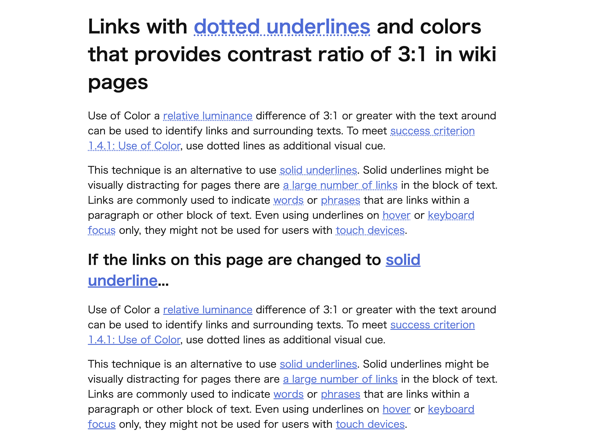
The standard link style is a solid underline.
However, WCAG 2 G183 states:
“If there are not a large number of links in the block of text, underlines are recommended for links in blocks of text.”
This implies that when there is a large number of links — such as on wiki pages or glossaries — a different, less visually distracting approach may be acceptable.
On the other hand, G182 provides various examples of non-underlined link styles such as blue bold text or red italic text, but these may not be reliably recognized as links by users.
Because most users’ experience still associates links with some form of underline, purely color- or font-based cues can reduce discoverability.
Therefore, I propose introducing an alternative, accessible link style — for example, a dotted underline — that remains recognizable as a link while reducing visual clutter in high link-density content.
Proposal
This is an additional proposal to Guideline 1.4 – Adjustable text style.
While the current draft focuses on font size, line height, and spacing,
this Method extends the concept to link text decoration, showing how authors can adjust visual presentation (e.g., using dotted underlines or subtle visual cues) to maintain link perceivability while improving overall readability.
Example: Use text-decoration-style: dotted instead of a solid underline to reduce clutter.
dotted-underline-link-example.html
References
- WCAG 3 Guideline 1.4
- WCAG 2.2 Techniques G182 / G183